Rockhead: Bold Display Power, Used Right
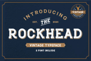
Rockhead isn’t just another bold font—it’s a confident, high-impact display typeface built for moments that demand attention. With its strong geometric structure, generous x-height, and tightly tuned letter spacing, Rockhead excels where clarity and presence matter most: headlines, logos, posters, hero sections, and branding elements. It’s not meant for body text—but when used with intention, it transforms ordinary layouts into memorable visual statements. That said, many creators—whether launching a small business site, designing a course landing page, or preparing a presentation—run into avoidable hiccups with Rockhead. Not because the font is flawed, but because it’s often misapplied without considering context, hierarchy, or technical fit.
Assuming Rockhead Works Everywhere (It Doesn’t)
One of the most common oversights is treating Rockhead as a universal solution. Its bold weight and tight proportions make it less legible at small sizes or in long paragraphs. Using it for navigation labels under 16px, product descriptions, or blog excerpts strains readability and weakens user experience. You might think “bolder = more professional,” but in practice, it can feel overwhelming or inaccessible—especially for readers with visual preferences or on smaller screens.
A better approach? Reserve Rockhead for primary visual anchors only: your site’s main headline, a featured testimonial quote, or a section divider. Pair it with a clean, highly legible sans-serif (like Inter, Open Sans, or even system fonts like -apple-system) for all supporting text. This contrast creates rhythm—not competition—and keeps communication clear.
Overlooking Licensing and Technical Compatibility
Rockhead is available through reputable foundries and platforms—but not all versions are equal. Some free downloads circulating online lack proper hinting, variable support, or full character sets (including accented characters, currency symbols, or punctuation needed for multilingual content). Others may be outdated or stripped of OpenType features like stylistic alternates or ligatures that improve typographic polish.
Using an unlicensed or poorly engineered version risks subtle but meaningful issues: inconsistent rendering across browsers, missing glyphs causing fallbacks (which break your design), or legal exposure if used commercially without permission. For example, a freelance designer using an unofficial Rockhead file in a client’s brand guidelines could unintentionally expose both parties to compliance risk.
Before downloading or purchasing: check the source. Prefer official channels—like the original foundry’s site or trusted marketplaces such as Adobe Fonts, Fontspring, or MyFonts. Verify license terms match your use case (web, desktop, app, or merchandise), and confirm file formats include WOFF2 for web use and OTF/TTF for design apps. Test the font in your actual workflow: open it in Figma or Illustrator, preview it in your CMS, and inspect how it renders on mobile Safari and Chrome.
Ignoring Color, Contrast, and Background Context
Rockhead’s strength becomes a liability when contrast is low. Its thick strokes need breathing room—both visually and chromatically. Placing Rockhead in light gray on a white background, or dark navy on charcoal, sacrifices legibility and undermines accessibility standards (WCAG AA/AAA). It also reduces perceived authority: what looks bold in isolation can read as “faded” or “uncertain” without sufficient contrast.
Instead, test Rockhead in real context. Use browser dev tools to simulate color blindness, or run quick checks with free tools like WebAIM’s Contrast Checker. Aim for at least 4.5:1 contrast ratio for large text (18pt+ or 14pt bold)—and higher is better. A deep indigo (#2E3A8C) on crisp white, or warm off-white (#FAF9F6) on rich charcoal (#333), often strikes the right balance between impact and comfort.
Misjudging Spacing and Layout Fit
Rockhead has inherent tightness—not just in letter spacing, but in line height and word spacing. Applying default CSS line-height (e.g., 1.2 or 1.4) to Rockhead headlines often results in cramped, top-heavy lines that feel unstable or hard to scan. Similarly, auto-kerned text in design tools sometimes overcompensates, creating uneven gaps between letters like “AV” or “To.”
Fix this proactively. In CSS, increase line-height to 1.1–1.15 for headings using Rockhead—and pair it with modest letter-spacing (0.5–1px) for improved rhythm. In design software, manually adjust kerning for problematic pairs rather than relying solely on auto-kern. And always preview at multiple viewport widths: Rockhead’s width can cause awkward line breaks on tablets unless you set responsive max-width or use text-wrap: balance (where supported).
Skipping Real-World Testing Before Finalizing
It’s easy to fall in love with Rockhead in a mockup—but love doesn’t guarantee performance. Without testing, you might miss how it behaves with dynamic content (e.g., auto-generated headlines from a CMS), longer-than-expected titles, or embedded icons or emojis nearby. A headline like “Our New Sustainability Initiative Launches This Fall!” may overflow containers or wrap awkwardly if not tested with realistic copy lengths.
Build in time to test across three conditions: different devices (mobile, tablet, desktop), varied content lengths (short, medium, long), and real user scenarios (e.g., “Can someone skim this headline in under two seconds?”). If you’re building a website, use live preview tools—not just static comps. If you’re printing, print a physical proof: screen rendering rarely matches ink density or paper texture.
Choosing Rockhead Thoughtfully, Not Just Boldly
Rockhead earns its place when it serves a purpose—not just when it looks impressive. Ask yourself: Does this headline need to command attention *and* convey trust? Is the tone aligned—confident but not aggressive, modern but not cold? Does it complement your brand voice, or does it distract from it?
For educators launching an online course, Rockhead works well for the course title—but not for module subtitles. For a café owner updating their menu board, it shines on the shop name banner, while a lighter, friendlier typeface handles daily specials. For a tech startup’s homepage, Rockhead adds gravitas to the value proposition—but only after ensuring the rest of the UI supports clarity, speed, and ease.
In short: Rockhead isn’t about turning everything bold. It’s about choosing boldness with precision. When you align its strengths—presence, structure, distinction—with real needs, constraints, and audiences, it stops being just a font and starts becoming part of your communication strategy.